On the surface, a button is just a clickable box. A rectangle, some text, maybe a splash of color, right?
But in reality, buttons are the silent decision makers of user experience. They guide us forward, reduce hesitation, and give users the confidence to act. A great button feels effortless. A bad one? We’ve all clicked “Cancel” instead of “Save” and regretted it instantly.
In this guide, let’s understand the button design principles that make interfaces more intuitive, accessible, and frustration-free.
If you’re new to improving interface clarity, you might also like our guide on the Do’s and Don’ts in UI Design.
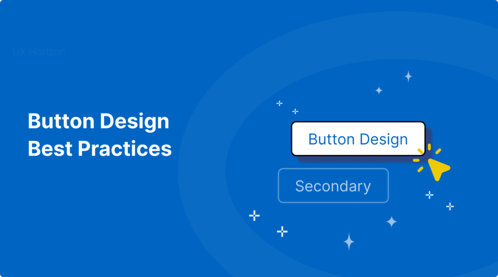
Primary vs. Secondary Actions
Not every button carries the same level of importance. Some actions are key decisions. Others simply support the flow.
Primary Buttons:
These are the stars of the screen bold, clear, and impossible to miss.
Example: A bright blue “Sign Up” on a registration page.
Secondary Buttons:
These are helpful but not meant to compete.
Example: A soft gray “Cancel” or “Back” button.
Think of it like a stage your primary button is the lead actor, and secondary buttons are part of the supporting cast.
Why it works: Without hierarchy, everything looks equally important and users hesitate to click.
If you’re looking to level up beyond buttons, check out our post on UI Design Practices That Actually Work.
Placing Buttons Where Users Expect Them
Button placement follows reading patterns, not guesswork.
For users in left to right reading cultures,
The main action like “Submit” or “Next” placed on the right. ,
while secondary actions like “Back” or “Cancel” are placed to the left.
Example:
On a checkout page, “Continue to Payment” on the right, while “Back to Cart” on the left
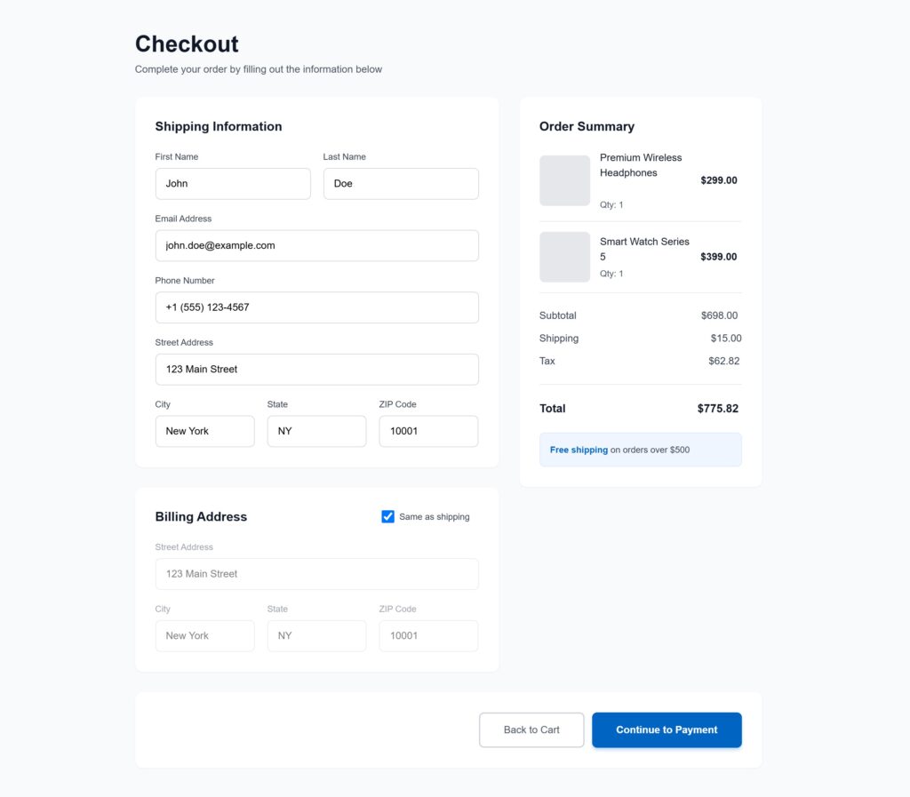
Why it works: It mirrors the flow of reading. You scan from left to right, action is waiting for you on the right, exactly where you'd expect it to be.
Create a Familiar Feeling with Consistency
When button styles keep changing, users lose trust. They hesitate.
“Why does this look different? Or something dangerous? Should I click this?”
Consistency removes doubt.
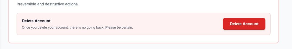
For example:
Blue solid buttons for all primary actions
Gray outlined buttons for secondary actions
Red reserved only for destructive steps like “Delete”
Consistency is not decoration, it’s clarity and predictable interfaces feel professional and easy to use.
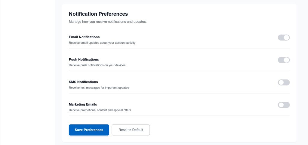
Group Buttons with Their Actions
A button should place right next to the thing it controls.
Imagine a “Save Preference” button floating at the top of a Notification settings page instead of directly below the form. That simple placement detail makes all the difference.
Also, give space between primary and secondary buttons to avoid accidental clicks, you never want someone tapping Delete instead of Edit.
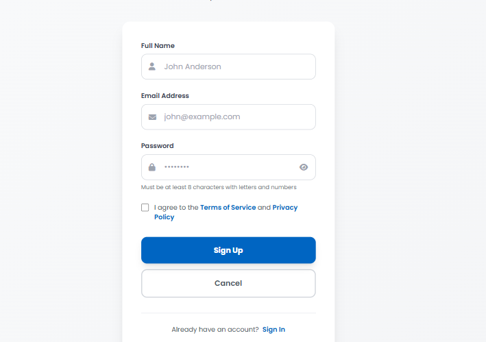
Write Button Labels That Speak Clearly
Your button’s text should be a command, not a suggestion.
Avoid generic words like “OK,” “Yes,” or “Submit” . They tell the user nothing.
Instead, tell the user exactly what will happen when they click.
Instead of “OK,” try “Delete My Account.”
Instead of “Submit,” try “Send My Application.”
Instead of “Yes,” try “Confirm My Order.”
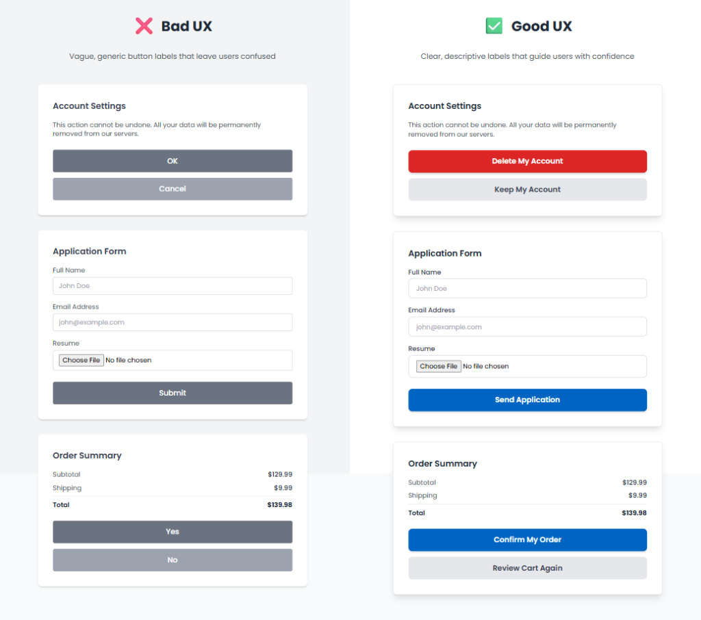
Users click when they know exactly what will happen.
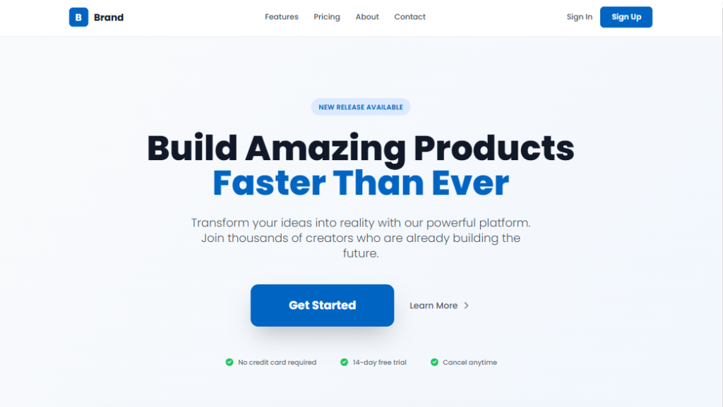
Show Only the Buttons Users Need
Not all buttons should shout equally loud.
You can create hierarchy by:
Color: Using a high contrast color for the most important button.
Size: Making the primary button larger than the others.
Position: Placing the key action where the user’s eye naturally lands.
Example:
On a homepage, a bold “Get Started” button stands out, while “Learn More” is styled as a subtle link.
Design for Everyone
Inclusive design means anyone can use your buttons, no matter their device, age, or ability.
Checklist for button accessibility:
- Strong color contrast for readability
- At least 44×44 px sizing for mobile-friendliness
- Descriptive labels for screen readers
- Icons paired with text when necessary
Example: A “Download Report” button that combines text + an icon helps all users understand instantly.
Want to learn more? The experts at the Nielsen Norman Group have in
Want to learn more? The experts at the Nielsen Norman Group have incredible, in depth resources on accessibility.
Avoid Showing Every Option at Once
Too many buttons can overwhelm users and cause decision fatigue.
Show options only when they’re relevant.
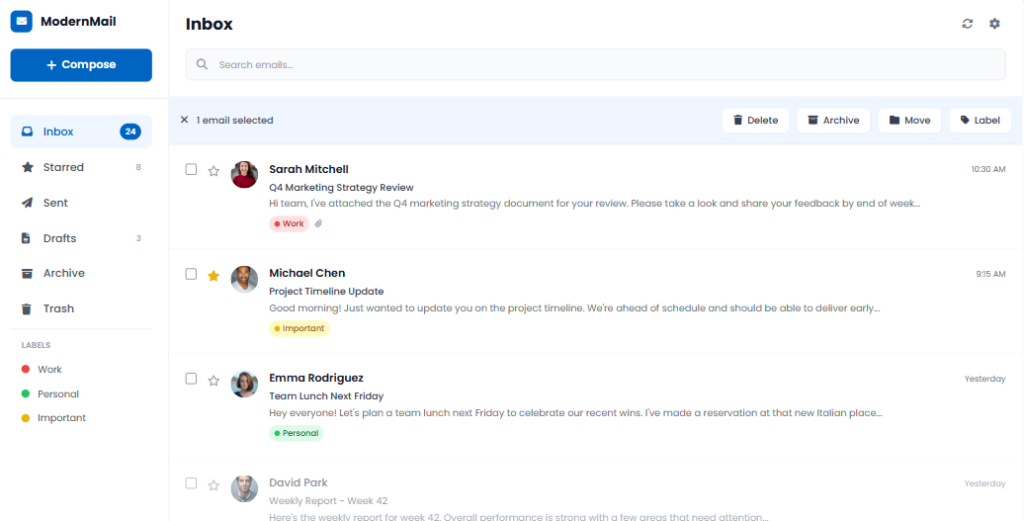
Example: In your email inbox, options like Delete, Archive, and Move appear only after you select an email. This keeps the interface clean and focused.
Every Click Counts
Buttons may seem small, but they carry big responsibility.
A single label, a few pixels of spacing, or a tiny color shift can change the entire flow.
Here are the golden rules:
- Make the primary action obvious
- Place buttons where users expect them
- Use clear, honest language
- Prioritize accessibility
- Don’t overwhelm with too many actions
Great UI doesn’t happen by accident, it’s created through intentional decisions, even in the smallest details like buttons.
Curious about the psychology behind user behavior?
Check out Design Psychology: Unlock the Secrets of User Minds .

I agree with your point about simplicity being key in UX. Less really is more.
Nicely written! The clarity and flow kept me engaged throughout.
The section on user behavior was particularly interesting. Thanks for sharing!