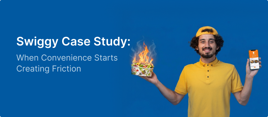
Ordering food should be the easiest part of your day. That’s the dream Swiggy sells us, and most of the time, it works. But if you look at the app through the eyes of a designer, you’ll notice a sneaky problem:
The app is built to make you buy, not necessarily to make your life easier.
Here is why that matters.
The Problem: Choice Overload
Swiggy gives us everything: endless restaurants, filters, “Buy 1 Get 1” deals, and constant recommendations.
But here’s the thing: more choices don’t lead to better decisions. Instead, users end up feeling:
- Stressed: Too much to look at.
- Distracted: Pop-ups and banners pull you away from your goal.
- Tired: You just wanted a sandwich, but now you’re comparing 10 different deals.
This is what we call “decision fatigue.” A task that should take two minutes ends up taking fifteen because you’re stuck in a loop of scrolling and comparing.
This is a classic case of cognitive overload — something I’ve explored deeply in my post on Cognitive Load in UX Design.
Key UX Issues in Swiggy ’s App Experience
1.The Never-Ending Scroll
The homepage keeps throwing categories at you—”Top Picks,” “Popular,” “Recommended.” It never actually helps you answer the simple question: “What should I eat right now?”
2. Deal Distraction
When discounts are everywhere, you stop looking for the food you like and start hunting for the best bargain. You end up ordering based on a coupon, not your actual hunger.
3. Messy Menus
The homepage keeps throwing categories at you—”Top Picks,” “Popular,” “Recommended.” It never actually helps you answer the simple question: “What should I eat right now?”
4. Pushy Selling
Those “Add a Coke for ₹40” pop-ups during checkout might make the company money, but they interrupt your flow and feel annoying when you’re already hungry.
This ties back to core principles I discussed in UI Design Practices That Actually Work…
How We Can Fix It
Swiggy doesn’t need more features; it needs to be a better guide.
- Create Shortcuts: Show a “Reorder your usual” button right at the top.
- Smart Timing: If it’s 8:00 AM, show breakfast and coffee—not biryani.
- Cleaner Menus: Hide the extra details until someone actually clicks on an item. Keep it simple first.
- Respect the User’s Time: If someone is moving fast, skip the extra sales pitches and let them check out in two taps.
Final Thoughts: What Swiggy Teaches Us About UX
The shift is simple: stop being a giant mall of food and start being a helpful assistant.
By clearing out the digital “noise,” Swiggy can help users decide faster and feel happier about their choices.
The Bottom Line:
Great design isn’t about giving people every possible option. It’s about giving them exactly what they need so they can stop thinking and start eating.