There is a quiet moment in every app or website that most designers completely miss. It doesn’t happen on the screen. It happens inside the user’s head. It’s that split second where a user pauses—not because your app is broken, but because the cognitive load is simply too high.
In the industry, we call this cognitive load. It’s invisible and quiet, but it’s the #1 reason people close your app and never come back.
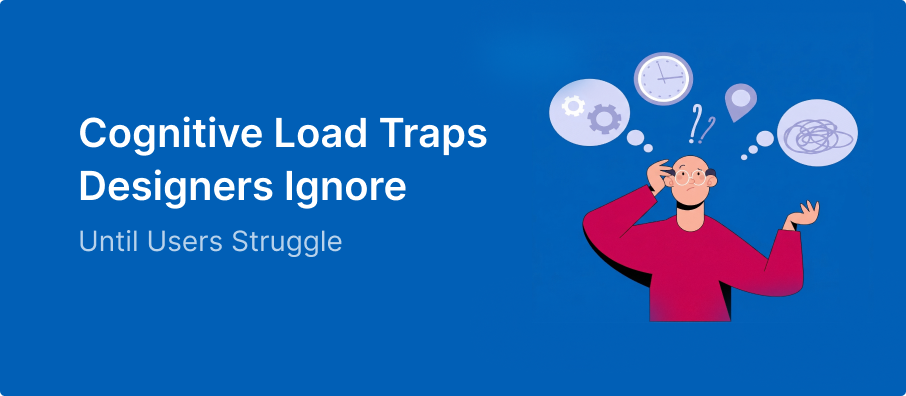
What Cognitive Load Actually Feels Like
Cognitive load isn’t always loud frustration. Most of the time, it’s just hesitation. It’s that voice in the user’s mind asking:
- “Wait, what happens if I click this?”
- “Am I in the right place?”
- “Did I do that correctly?”
As a designer, you already know how the flow works. You built it. But for the user, every unknown is a mental tax.
1. The Trap of “Equal” Choices
When everything looks important, nothing stands out.
This is a classic example of Hick’s Law: the more choices you give a user, the longer it takes them to decide.”
If you have three buttons on a page and they all have the same color and size, you aren’t giving the user “freedom.” You are giving them a chore. They have to stop and compare them to figure out which one matters.
The Fix: Use a clear visual hierarchy. Make the main action bold and keep the others quiet.
See more on this in my guide to UI Design Do’s and Don’ts – Part 1
2. Hidden Decisions in “Simple” Steps
We often think “Sign Up” is just one step. But for the user, it’s a chain of mental hurdles:
- “Which email should I use?”
- “Is this password strong enough?”
- “Do I really want to agree to these terms?”
Users don’t see a single button; they feel the effort of every tiny decision inside it.
3. The “Helpful” Noise
Sometimes we try so hard to be helpful that we make things worse. We add tooltips, extra instructions, and long paragraphs of text.
But users don’t read—they scan. When you add more text, you aren’t adding clarity; you are adding noise. If a button needs a paragraph to explain it, the button is the problem, not the text.
4. Changing the Rules Mid-Game
If a “Next” button is on the right on one screen and moves to the left on the next, you just broke the user’s trust.
Now, they can’t rely on habit. They have to think before every click. Consistency is mercy—it lets the user move through your design on autopilot.
5. Asking for Too Much, Too Soon
Think of your product like a first date. If you ask for a phone number and a home address before you’ve even said “hello,” the user is going to leave.
Every form field is a barrier. If you ask for information before the user understands the value of your product, the mental load becomes too high to bother.
This is especially true when Designing for Low Digital Literacy Users, where every extra step can lead to a complete drop-off.”
6. Designing for “Perfect” Users
Designers love clean, short names and perfect photos. But real life is messy.
- What happens if the user has a 40-character last name?
- What if their internet is slow and the images don’t load?
If your design doesn’t handle reality, the user has to do the work to figure out why things look “broken.”
7. The Silence of No Feedback
If a user clicks a button and nothing happens for two seconds, they start overthinking.
- “Did I miss the button?”
- “Is the app frozen?”
- “Should I click it again?”
Uncertainty is heavy. Good design always talks back. It tells the user: “I saw that, I’m working on it, and here is what’s next.”
The Real Insight
Great UX isn’t about being impressive. It’s about being obvious.
If a user has to stop and think about how to use your interface, you have already lost the battle against cognitive load. The goal isn’t to add more features; it’s to remove the need to think.
When you get it right, the user won’t even notice your “design.” They’ll just notice how easy everything felt. And that is the biggest win a designer can have.