Have you ever visited a website that felt easy? Where everything was simple and worked together nicely, from the navigation to the buttons? That’s not magic. That’s good UI design.
As someone new to UI design, you might ask: “Why does it look so easy?” The answer is “The basics.” And in this four-part series, you will learn about 30+ UI principles that take nice designs, and make them smart and usable.
UI Truths Every Designer Should Know
1. Keep It Obvious
Design should not be puzzle like for users. Users should never ask themselves what they should click next or where they are in their journey.

Why it works:
- Good placeholders reduce cognitive load on users and minimize errors when filling out forms.
- Use examples of placeholder text that are instructive, for example: using a phone number format or showing an example for email IDs.
- Don’t use an ambiguous example placeholder like “Enter here” which does not synthesize any instruction.
💡 Pro tip: Place holders should supplement the label, they should not replace it altogether. Labels should always remain on the screen and comply with accessibility standards.
2. Maintain Visual Hierarchy
Not all elements are equal and they shouldn’t be treated as such.

Why It Works?
- A good hierarchy will highlight the main actions, improve readability and conversions.
- Use contrast, text size or bold text to highlight the most important elements and create a visual hierarchy.
- Avoid text blocks that are flat, consistent sizing that causes readers to loose their place and needs to brace for the main message.
💡 Pro tip: Start in grayscale. If it works in greyscale, it will work in color!
3. Use Feedback States
An effective user interface doesn’t only display; it displays and it also provides feedback. When a user clicks a button, submits a form something happens that may take a few seconds (like a file upload). Feedback states are how your design communicates back to users that some sort of activity is occurring.

Why It Works?
- Real-time feedback helps to build user confidence and keeps frustration to a minimum.
- Let users know how strong their password is, or remind them of the project heat map validation as they type.
- Don’t show errors only after the user presses a submit button.
💡 Pro Tip: You should incorporate color and icons (check marks or crosses) along with text for feedback. Just be sure color is not the sole indicator.
4. Use Human-like Language
Design is not only Visual It Speaks. Always design Interface to speak like a human, not like a robot.

Why It Works?
- Creates trust and familiarity
- Users feel supported especially during errors or decision points
- Use casual, human-sounding text, such as “Looks good” or “Take a new photo.”
- Don’t use formal or robotic text, such as “Confirm and Continue,” and no emotion.
💡 Pro Tip: Read your UI text out loud. If it sounds awkward to say conversationally, then you need to rewrite it.
Instead of robotic phrases, using friendly, human-first microcopy like “Oops! That email didn’t look right” makes the interface feel more personal. Here’s a great guide on writing microcopy that sounds human.
5. Maintain Horizontal Alignment
Alignment impacts whether the visual design will feel “clean and crisp” versus “messy and confusing.”

Why it is important?
- Creates visual hierarchy and balance
- Reduces user effort and cognitive processing
- If applicable, keep your text fields, labels (buttons) or other UI items aligned horizontally for flow of visual scanning.
- Don’t use random combinations of left-, center-, and right-aligned elements — this causes visual fatigue.
💡 Pro tip: Use vertical guides on your design tools to check alignment between headers, buttons, and content blocks.
6. Pair Icons with Labels
Icons are great, but without context, they might be confusing to your users. Always clarify what the icon does.
Why you should do it?
- Increases recognition speed
- Improves accessibility and reduces ambiguity
- Add text labels like “Edit,” “Schedule,” or “Archive” next to your icons so the meanings are clear.
- Don’t use an icon by itself and expect that users will know what it is.
💡 Pro Tip: Labels may fade on hover or tap in certain layouts, they should never fully disappear.
Pairing icons with labels improves both clarity and accessibility. These WCAG guidelines provide detailed recommendations.
7.Use a Progress Bar for Multi-Step Flows
Tell users where they are in the journey and what to expect next, especially for a long or multi-step process.

Why It Works?
- Lessens anxiety by showing users their progress.
- Eases the completion of longer tasks (think forms or onboarding).
- Use some type of a step indicator like “Step 2 of 4,” so the user knows where they are in the flow.
- Don’t make users guess how long a process will take — uncertainty causes drop-offs.
💡 Pro tip: Keep progress indicators short and sweet. Simply orient the user enough to provide direction, without distracting.
Progress indicators guide users through long flows and reduce abandonment. Google’s Material Design system outlines best practices for progress indicators.
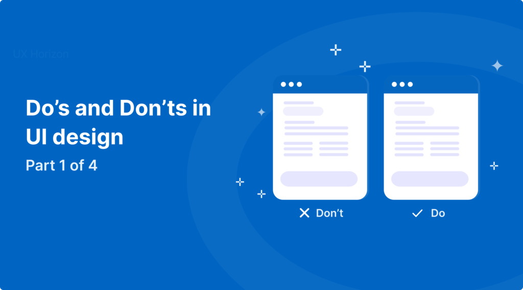
Wrapping Up Part 1
If you think your designs feel an “off” and you are not sure why, really pay attention to your space, layout, and alignment. These small tweaks can bring your entire UI design from “fine” to “wow”.
👀 Coming in Part 2:
Design is not simply about creating individual screens; it’s about how your entire product feels across all screens.
In Part 2, we will look at invisible tools behind consistent UI design like Spacing systems, Typography, Color systems, Component libraries and design systems, Platform conventions that save the user from confusion
These are the patterns, principles, and systems that make your design feel consistent, dependable, and trustworthy even if no one recognizes them consciously.
Would you like me to write Part 2 in this style next?
If you’re interested in how users think, check out our guide on Creating Effective User Personas.