Before I entered the UX field, I didn’t realize how much Form Design could impact someone’s mental state..
I had filled countless government forms,
Forms for licenses.
Forms for exams.
Forms for registrations.
And every time… there was the same feeling.
That slight panic before clicking “Submit.”
The fear of making one small mistake that could cost you an opportunity.
If you’ve ever filled one of those forms, you already know this feeling. Even today, many students and professionals even tech-savvy ones still go to cybercafés just to fill forms.
The Real Problem With Most Form Design
Let’s be honest. Most forms are not difficult.
Because the struggle is real.
- Poorly written labels
- Confusing input fields
- Strange file size format rules
- Errors that appear only after clicking Submit
- Pages that reset without warning
I’ve seen people sit in front of screens with Confusion+ fear of making a mistake.
Not because they lack knowledge.
Not because they can’t use a computer.
But because the form design creates pressure.
Form design is not about fields.
It’s about:
- reducing effort
- reducing anxiety
- helping users complete something important
And that realization is a huge part of why I ended up choosing UX to improve a pain most people experience but rarely talk about.
1. Reduce Typing Wherever Possible
Typing=effort.
More typing=more mistakes .
Use “Smart Defaults.” Instead of forcing a user to recall and type their City, District, and State (which they might spell differently than your database expects), use a Pincode-First logic.
Example:
When a user enters “751013,” the system instantly fetches “Bhubaneswar” and “Odisha.” The user feels a sense of relief the machine is doing the work for them, and they know the data is accurate.
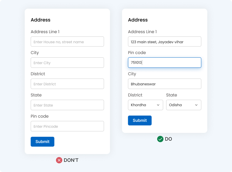
Less typing = less effort = faster completion
Every extra keystroke increases drop-off probability.
2. Stop Hiding Important Information
Designers sometimes try to be “minimal”……and remove labels.
Relying only on placeholders looks clean, but breaks usability.
Example:
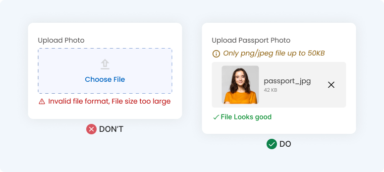
If your system only accepts JPEGs under 50KB, don’t wait for the user to find a photo, crop it, and hit upload to tell them it’s too big. Put that requirement right under the label. Let them “Recognize” the rule before they have to “Recall” a file from their folders.
Forms are not the place for visual minimalism.
They are the place for clarity.
Users should recognize, not remember. This follows a core UX principle from Nielsen Norman Group.
3. Don’t Hide Simple Decisions Behind Complexity
I see this everywhere: a dropdown menu for a “Yes/No” or “Gender” choice. Why make a user click twice (once to open, once to select) for a simple decision?
Use Selectable Chips or Radio Buttons. Visibility reduces decision time and mental load.
Example:
For a Gender selection, seeing “Male,” “Female,” and “Other” as clear, tappable buttons allows for a one-tap decision. It feels faster and more modern than an old-fashioned “Select” menu.
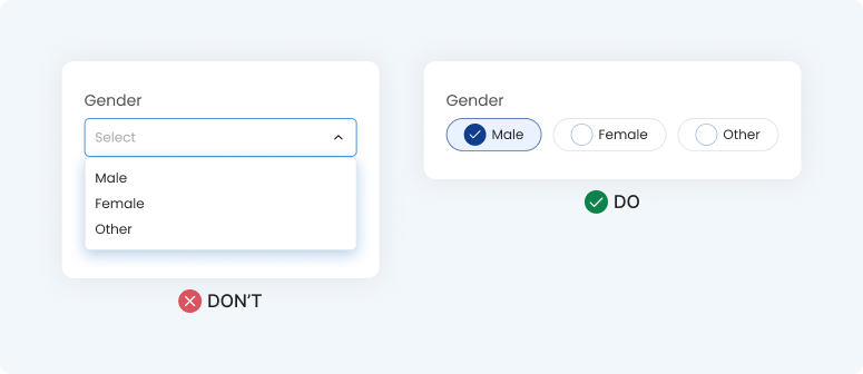
Fewer clicks = faster decisions
Visibility reduces decision time. Hidden options increase cognitive load.
Also read Design Psychology: Unlock the Secrets of user Minds.
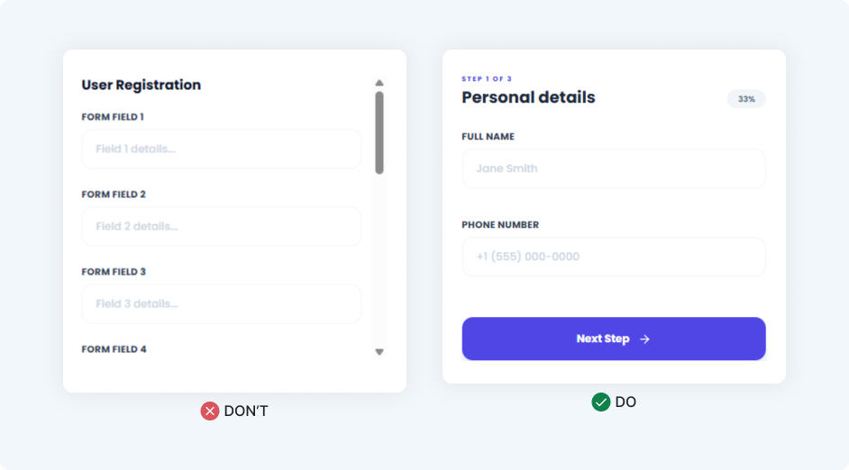
4. Break Long Form design Into Small Steps
When a user sees a long, endless scrolling form, they don’t think “This is detailed.” They think, “This is going to take forever.” That creates instant stress.
Break the process into logical “chunks.” Small steps feel much easier to conquer than one giant task.
Example:
Instead of 30 fields on one page, give them 3 steps. Step 1: Who are you? (Name/Phone), Step 2: Where are you? (Address), Step 3: Documents. Adding a progress bar acts like a finish line—it keeps them motivated to reach 100%.
Also read Do’s and Don’ts in UI design
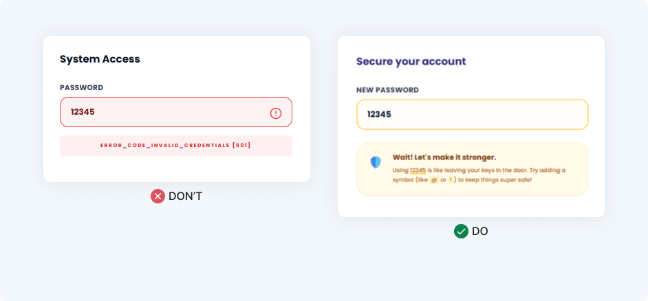
5. Make the Form Feel Like a Conversation
Most forms sound like they were written by a database cold, formal, and punishing. But a form is a conversation. When a user makes a mistake, they are already frustrated. Don’t make it worse with “INVALID_INPUT_CODE.”
Use Conversational Microcopy. Tone changes emotion, and emotion changes how much a user is willing to persevere.
Example:
Instead of a red box screaming “ERROR,” try a supportive nudge. If a password is weak, say “Wait! Let’s make it stronger.” It feels like a helpful friend is guiding them, rather than a strict teacher scolding them.
Turning Messy Form design to Simple Experiences
Let’s go back to that government form. Imagine it redesigned with clear labels, fewer fields, smart suggestions, and a friendly tone.
The user didn’t change. Their computer skills didn’t change. The layout did.
The user was never the issue—the design was. Form design isn’t just about UI components; it’s about those moments where a user feels pressure. Next time you design a form, ask yourself
“Am I making this person’s life easier… or harder?”
Because small design decisions create big human experiences.