Table design in UX plays a bigger role than most designers realize. There’s a specific moment that happens when a user opens a page and sees a data table.
They don’t say anything. They just… pause.
It’s not because the data is wrong or the UI is “broken” in the traditional sense. It’s because the screen suddenly feels like a chore. Tables are supposed to organize information, but more often than not, they overwhelm the user instead of simplifying their life.
That’s where smart table design comes in. It’s the difference between a spreadsheet and a functional tool.
The Problem with Table Design
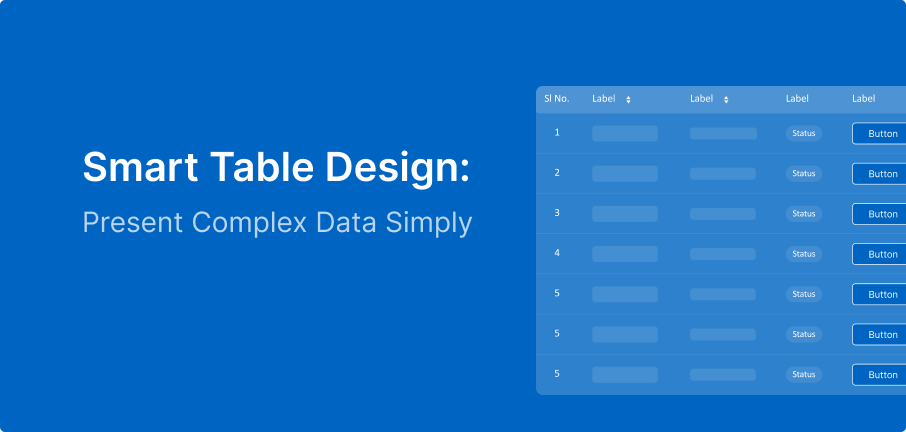
Most tables are designed like a basic Excel sheet: rows, columns, and data dumped everywhere. While technically correct, it’s practically useless for a human being.
Why? Because users don’t come to tables to read. They come to find. They are looking for a specific value, a trend, or an outlier. If your table doesn’t support quick scanning, you are spiking the cognitive load and forcing the user to work way too hard.
What Users Actually Do (The Reality Check)
Users don’t go row-by-row like they’re reading a book.. their eyes move.
They scan for:
- Patterns
- Familiar labels
- Visual cues
The 7 Deadly Sins of Table Design
1. Too Much Data, No Direction
When everything is highlighted, nothing is. If every cell has the same font weight and color, the user has no idea where to look first.
The Fix: Use visual hierarchy. Guide the eye to the “Primary Key” (like a name or ID) so the user has an anchor point.
2. “System” Language vs. “User” Language
Headers like “Ref_ID_04” or “Classification Type” might make sense to a database architect, but they are gibberish to a human.
The Fix: Use labels that answer the user’s questions. Clarity is more important than being technically “correct” according to the backend.
3. Alignment That Breaks Flow
Alignment isn’t about what looks “pretty”—it’s functional. Randomly centered text makes the eye jump back and forth, which is exhausting.
The Fix: Follow the golden rule: Text to the left, numbers to the right. This allows for instant comparison of values.
4. No Entry Point
A table without a clear header or a highlighted row feels like a wall of noise.
The Fix: Use bold headers and subtle row separators. The design should act as a map, not a mystery.
5. Action Overload
When a single row has buttons for Edit, Delete, View, Download, Share, and Archive, the user suffers from choice paralysis.
The Fix: Use “hover actions” or a “more” menu. Don’t show every possibility until the user actually needs them.
6. Forced Scrolling
Forcing a user to scroll through 500 rows to find one item isn’t an interaction—it’s an obstacle.
The Fix: Give the user control. Sorting and filtering aren’t “extra” features; they are the heart of a usable table.
7. Designing for Desktop, Forgetting Reality
A table that looks great on a 27-inch monitor often falls apart on a laptop or tablet.
The Fix: Design for responsiveness. Use priority columns, horizontal swiping for secondary data, or expandable rows to keep the experience clean on any screen.
The Real Insight: Tables are for Decisions
At the end of the day, tables aren’t about storing data they are about decision-making. Users look at a table because they need to compare, choose, or act.
How to Design Smarter
If your table design slows down that decision, it isn’t helping.
Next time you’re building a table, stop asking “How do I show all this data?” and start asking “How do I make this easy to scan?”
Focus on:
- Reducing clutter (remove unnecessary borders).
- Meaningful labels (speak like a human).
- Quick actions (don’t make them hunt).
- Smart filtering (let them find it fast).
Final Thought
A table can either simplify complexity or hide it behind a rigid structure. Great UX isn’t about the amount of data you can fit on a screen; it’s about how quickly a user can understand it.
Users don’t want more data. They want faster clarity.