Dark patterns in UX design don’t look like manipulation at first.
There was a time I almost bought something I didn’t need.
It wasn’t because the product was great. It was because the website made me panic.
“Only 1 left!”
“5 other people are looking at this!”
“Sale ends in 2 minutes!”
I almost hit buy. Then I stopped. I realized: This isn’t helpful design. This is pressure.
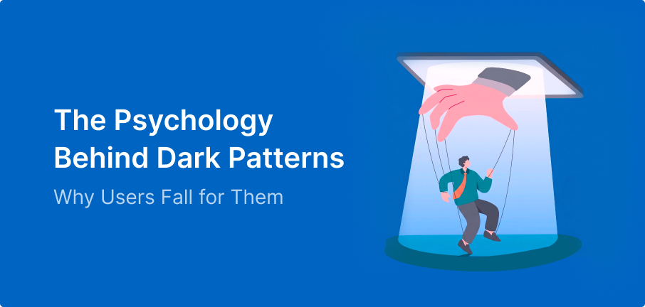
What Are Dark Patterns?
We usually call these “tricks,” but it’s deeper than that. Most people don’t feel tricked they feel convinced. Dark patterns don’t force you to do things; they just nudge you until you give in.
Understanding how users think is equally important in building better interfaces read more in my blog UI Design Do’s and Don’ts Part 1
Why do we fall for them?
It’s not because we are messy or distracted. It’s because these designs use human psychology against us.
1. Urgency Makes Us Act Faster Than We Think
When we see “Only 2 seats left,” the Scarcity Principle kicks in. We stop asking, “Do I need this?” and start worrying, “What if I miss out?” That shift changes everything.
Even when we doubt it, we still feel the pressure—because of the Scarcity Principle, where limited availability increases perceived value.
2. Default Choices Decide for Us
Ever seen a pre-checked box or a subscription already turned on?
That’s the Default Effect. We usually stick with what’s already selected because it’s the easiest path. Changing it feels like extra work, and humans naturally avoid extra effort.
3. Too Many Choices Make Us Choose Poorly
When a site hits you with too many plans or confusing prices, you get Decision Fatigue. Your brain gets tired and just picks something to get it over with. That’s exactly when these patterns win.
I’ve seen this especially while designing for users with low digital confidence (explored more in my blog on designing for low digital literacy users).
4. Guilt Makes Us Comply
Those buttons that say, “No thanks, I don’t want to save money,” are called Confirm shaming.
They make you feel bad for saying no. Since we naturally hate feeling uncomfortable, we often just click “Yes” to avoid the guilt.
5. Progress Feels Like Commitment
If you’ve already filled out four pages of a form, the Sunk Cost Fallacy makes you feel like you have to finish.
Dark patterns use progress bars and hidden prices to keep you moving forward, even if you aren’t sure anymore.
6. Authority Makes Us Obey
Dark patterns don’t work because people are weak; they work because we are human.
They tap into our FOMO, our desire for ease, and our emotional triggers. That’s what makes them dangerous.
The Ethical Line in UX Design
As designers, we know how behavior works. So the real question isn’t, “Can we use this?”—it’s, “Should we?”
The same psychology that manipulates can also be used to help.
- Instead of fake urgency → Create clarity.
- Instead of forcing a choice → Support their decision.
- Instead of hiding the catch → Make it visible.
Wrapping Up
Dark patterns don’t look like mistakes; they look like smart design. That’s why they’re so hard to resist. But once you see them, you can’t unsee them. And for a designer, that awareness is everything.
Good design builds trust. Dark patterns break it.