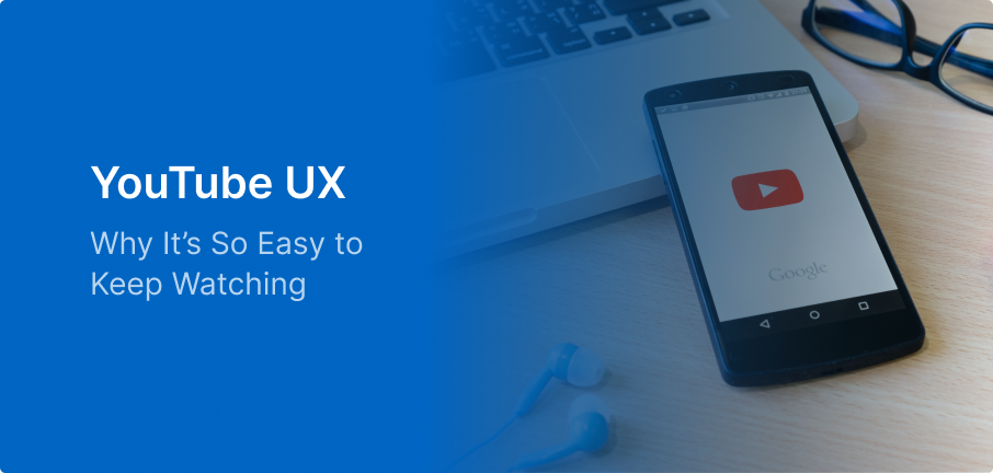
We’ve all been there: you open YouTube to watch a quick two-minute tutorial, and suddenly it’s 45 minutes later and you’re deep into a video about how to grow organic tomatoes.
That “rabbit hole” isn’t an accident. It’s the result of an incredibly calculated user experience designed to make stopping feel harder than continuing. Here’s a breakdown of how YouTube keeps us hooked, where the experience is starting to feel cluttered, and what the future of video UX looks like.
This experience is deeply tied to how users process information, something I’ve explored in Cognitive Load in UX…
What YouTube Gets Right
YouTube doesn’t just host videos; it’s a discovery engine that does the heavy lifting for you.
1. The Death of the Search Bar
In the early days, you had to search for what you wanted. Now, the content comes to you. Between the highly personalized home feed and the “Up Next” sidebar, YouTube reduces the cognitive load of “choosing” what to watch.
2. Zero-Friction Playback
From the moment you click, everything is built to keep you in the flow:
- Autoplay: Removes the need to make a decision.
- Resume Playback: Pick up exactly where you left off across any device.
- Instant Loading: Even on slower connections, the player is optimized to start almost immediately.
3. The Thumbnail Economy
YouTube’s UX relies heavily on visual storytelling. The combination of high-contrast thumbnails and hovering video previews allows users to “vet” a video in less than a second.
4. Multi-Intent Design
Unlike platforms that do only one thing, YouTube successfully houses multiple “modes” of use. Whether you are there for Learning (How-To’s), Entertainment (vlogs), or Atmosphere (lo-fi music), the interface adapts to support those different goals within the same ecosystem.
Where the UX Starts to Fray
When a platform gets this big, “frictionless” can eventually turn into “cluttered.”
- Recommendation Overload: Sometimes the sidebar is so full of “good” options that it actually creates choice paralysis. Discovery starts feeling like digital noise.
- The War for Attention: Between the comments section, the overlay ads, and the constant “Related Video” pop-ups, the actual watching experience can feel incredibly distracted.
- Algorithm vs. Intent: Users often feel like they’ve lost the steering wheel. If you watch one video about a specific topic once, your entire feed might be hijacked by that topic for a week.
- Generic Search: Sometimes, the search results prioritize “popular” over “relevant,” making it harder for users with a specific, niche intent to find what they actually need.
Some of these challenges go against principles in UI Design Practices That Actually Work…
The Next Move: Intent-Aware UX
The next evolution for YouTube isn’t about more content; it’s about more meaningful discovery.
- Transparency in Recommendations: Providing a “Why this video?” tag could help build trust and let users refine their preferences more accurately.
- Focus Mode: A simple toggle to hide comments and sidebar suggestions would be a game-changer for users trying to learn or engage in “deep watching.”
- Intent-Based Filters: Imagine a search bar that lets you filter by “Quick Answer,” “In-Depth Course,” or “Entertainment.” It would drastically reduce the “time to value.”
- Designing for Well-being: While “Take a Break” nudges exist, they feel like an afterthought. Truly great UX should respect the user’s time as much as it respects their engagement.
Why the Experience Still Wins
Even with its flaws, YouTube remains the gold standard because it predicts user needs. It understands that most of us are lazy—we want the best content with the least amount of effort. By keeping the interaction seamless, they’ve turned a website into a habit.
Final Thought
Great UX removes friction, but the best UX respects the human on the other side of the screen.
Just because a design can keep a user watching forever doesn’t always mean it should. The future of the industry is moving away from “endless scrolling” and toward balance.